Pottery Barn
Email Style Guide & Design System
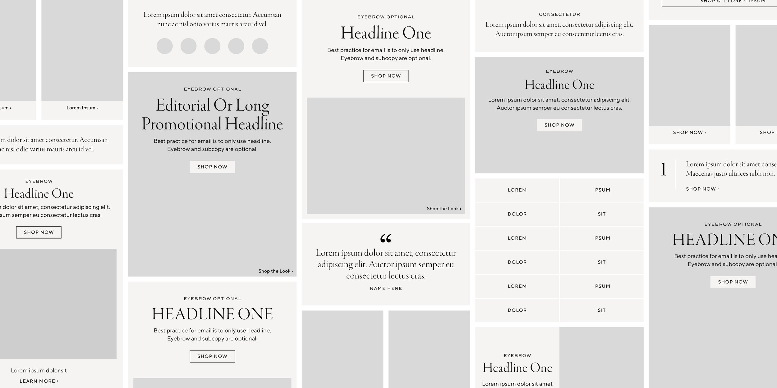
Lead the design of Pottery Barn’s Email Style Guide & created a Figma design system to help designers work efficiently and collaboratively using atomic design to help create components, modules, templates, and libraries.

PB Style Guide
The initial design phase started with creating a new system of typography across Pottery Barn’s digital creative marketing channels. The system needed to be flexible, legible, and align with Pottery Barn’s new type system using Garamond and Sweet Sans, previously Canela and TT Norms.
Components, Modules, & Templates
The goal in setting up our components, modules, and templates was to create a modular system that designers can easily pick up and change as needed. You can just as easily grab a fully built out email from the templates folder or build a new one from scratch using the individual components & modules.
Seasonal Libraries
Pottery Barn’s email channel deals with high volume and tight turnaround times. A seasonal library is published as variants to help create efficiencies while maintaining creative consistencies between image crops per email. The team is able to pull these variants directly into their emails and use the drop down to easily add and swap.
At the start of each season, the seasonal libraries is carefully curated to match the big ideas & aesthetics of the season as defined by Pottery Barn leadership. The email channel creative leads ensure all imagery aligns with catalog and site for a better cross-channel marketing experience. By spending time at the beginning of each season carefully selecting imagery that meets business priorities, the team is able to spend more time focusing on creative strategy and crafting better storytelling through that channel.


